Sunday, February 14, 2010

Beggarstaff Brothers

"Don Quixote"(1896)
The proportions in this piece are nice. However, the left side is a lot heavier than the right so to me it throws the composition off. It would be better it the piece would have been balanced better.

"Rowntree's Elect Cocoa" (1899)


Again color is very minimal. However the color seems to unify the whole piece which makes it come together nicely.
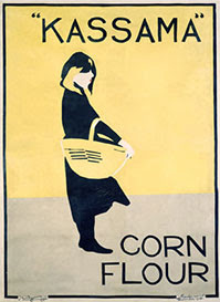
"Kassama Corn Flour" (1900)

This poster is very simple. There is minimal color and also there is a nice balance between the forground and background.
All of these pieces have one this in common, they all are minimalistic in color. There is barely any color used but what color is used seems to go along with the advertisement of the individual posters. For example, the "Rowntree's Elect Cocoa" is overall brown in color but cocoa is brown so color goes along with the advertisement. All of these pieces are basic as well. There isn't a lot going on but simple is sometimes best.

Wednesday, February 3, 2010

Leonetto Cappiello


"Jaquin" (1930)
This piece is full of color and movement. It also has texture because of the ribbons on the figure's costume. This piece also has a nice rhythm to it from the way the ribbons on the costume move.
"Campari" (1921)
Again Cappiello uses bright colors to catch the viewer's eye. There is also movement in this piece with the way the orange peel goes up and around the figure. The orange peel also unifies the piece because the viewer follows the peel all the way up and down the piece. The viewer doesn't get stuck anywhere because of it.


"Chocolat Klaus" (1903)
In this design Cappiello uses a lot of color. His use of bright colors makes the design pop off of the black background. There is also a nice balance between the figure in the mid-ground and the lettering in the foreground. They don't over power each other.