Monday, April 19, 2010

Alphonse Mucha Show

1700-7075.jpg

Champenois (1900)


This was one of my favorite pieces I saw. Alphonse Mucha's use of color is beautiful and really makes the piece come to life. The rhythm and fluidity of the lines and the pattern of the background really make the woman stand out.

Friday, March 26, 2010

Alphonse Mucha

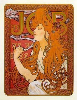
Job (1897)


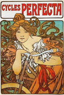
Cycles Perfecta

Champenois Imprimuer (1897)

Alphone Mucha was a painter and designer during the late 1800's into the early 1900's. Mucha was a part of the Art Nouveau movement in France. He bacame a household name duing this time because he designed beautiful works that no one thought was art before the "new art" movement. These works included champagne advertisements and stage sets.


Mucha was a huge influence on graphic design. His use of bold curvy lines and pattern was not like anyone else's during that time and he became known for it. He created numerous advertisements for many different people and companies such as Champenois.


Sunday, February 14, 2010

Beggarstaff Brothers

"Don Quixote"(1896)
The proportions in this piece are nice. However, the left side is a lot heavier than the right so to me it throws the composition off. It would be better it the piece would have been balanced better.

"Rowntree's Elect Cocoa" (1899)


Again color is very minimal. However the color seems to unify the whole piece which makes it come together nicely.

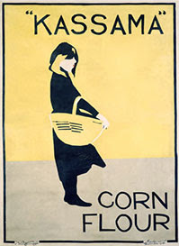
"Kassama Corn Flour" (1900)

This poster is very simple. There is minimal color and also there is a nice balance between the forground and background.
All of these pieces have one this in common, they all are minimalistic in color. There is barely any color used but what color is used seems to go along with the advertisement of the individual posters. For example, the "Rowntree's Elect Cocoa" is overall brown in color but cocoa is brown so color goes along with the advertisement. All of these pieces are basic as well. There isn't a lot going on but simple is sometimes best.

Wednesday, February 3, 2010

Leonetto Cappiello


"Jaquin" (1930)
This piece is full of color and movement. It also has texture because of the ribbons on the figure's costume. This piece also has a nice rhythm to it from the way the ribbons on the costume move.
"Campari" (1921)
Again Cappiello uses bright colors to catch the viewer's eye. There is also movement in this piece with the way the orange peel goes up and around the figure. The orange peel also unifies the piece because the viewer follows the peel all the way up and down the piece. The viewer doesn't get stuck anywhere because of it.


"Chocolat Klaus" (1903)
In this design Cappiello uses a lot of color. His use of bright colors makes the design pop off of the black background. There is also a nice balance between the figure in the mid-ground and the lettering in the foreground. They don't over power each other.

Saturday, January 30, 2010

Aubrey Beardsley

"The Dancer's Reward" (1893)

This piece is simplistic yet detailed at the same time. A lot of the detail can be seen in the rendering of the dress and hair and well as the head on the table. It is simplistic because there isn't a lot going on in the piece and there is minimal color.


"John and Salome" (1984)
I really like how Aubrey Beardsley has composed this piece. There is great detail in the figures especially the figure to the right with the clothing. Again like the first piece it is simplistic in composition and in color.

"The Peacock Skirt" (1894)
I really like how detailed this piece is thats why I chose this piece. The composition is very nice and it is amazing how Aubrey Beardsley was able to compose such a detailed piece just by using print making techniques.


From looking at these three works, I can summerize that Aubrey Beardsley was a lithography artist. His art is very detailed yet simplistic in composition. His use of hardly any color also makes his work stand out and it makes the details in the pieces pop out more because there is no color. I think thats why I like it because I like more simplistic type art.


Sunday, January 24, 2010

William Bradley-Art Nouveau Artist


1) Thanksgiving No. from The Chap-Book (1895)
I really like the use of minimal color in this piece. The piece is mainly red but it makes the poster stand out. I also like how William Bradley rendered the womans dress. The only thing I don't like is that you really can't see the title of the magazine


2) Victor Bicycles (No Date)

I really like this piece of work. I like how the colors come together because it really makes the piece pop. The compostion is also really nice.

3)The Modern Poster (No Date)

I like the way William Bradley has rendered the peacock feathers. Even though there isn't a lot of color, it is still very bold and it is a great piece.